


Neutral doesn’t mean boring, though it’s often mistaken for the safe choice, the color you pick when you don’t want to commit to anything. In our experience, choosing the right neutral is one of the harder color decisions in a home, not because there aren’t enough options, but because there are too many, and most of them look nothing alike depending on the room they’re in.
A good neutral isn’t just beige or white by another name. It has an undertone, a warmth or coolness that shifts depending on the light, the surrounding materials, and the time of day. These are the neutral paint colors we come back to project after project, and why they hold up.
Warm Whites
A true warm white is one of the hardest colors to get right, and one of the most versatile once you do. It reads soft and inviting rather than stark, and it plays well against the wood tones, brass, and natural textures that define cottage interior design. The mistake we see most often is choosing a white that looks warm on a swatch but turns cold and clinical once it’s on four walls in natural light. Testing a warm white in the actual room, at different times of day, isn’t optional.
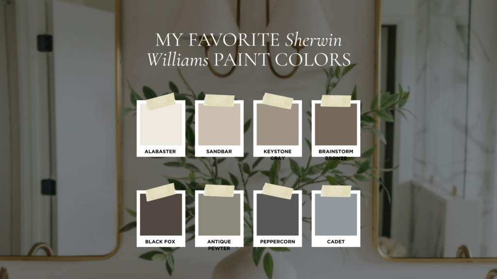
Our go-to here is Alabaster by Sherwin Williams. It stays soft without ever tipping cold, which is exactly why it shows up in so many of our projects.
Greiges
A greige, a soft blend of gray and beige, is the neutral we reach for most in rooms that need to feel grounded rather than bright. It’s a color that changes character depending on what’s around it, warmer next to wood and brass, cooler next to black and white. Greige rooms tend to photograph differently than they feel in person, so it’s worth seeing a greige on your own walls before committing.
Keystone Gray by Sherwin Williams is one of our most-used greiges, warm enough to stay cozy, gray enough to stay grounded.
Soft Greens
Soft, muted greens have become one of our most-requested neutrals, and we don’t think of them as a trend so much as a natural extension of the neutral family. A green with enough gray or brown in its undertone reads as calm and grounded rather than saturated or seasonal. It works particularly well in kitchens, powder rooms, and bedrooms, anywhere we want a little more depth than a true neutral offers without introducing a full color statement.
Antique Pewter by Benjamin Moore is a favorite here, a soft, gray-green neutral with just enough depth to read as a color without ever feeling like a bold statement.
The best neutral paint colors share one thing in common: they aren’t flat. They have an undertone that responds to the room around them instead of fighting it.
The Deeper Neutrals We Reach For
Not every neutral in our palette is light. A handful of deeper, moodier neutrals show up just as often, on cabinetry, doors, exteriors, and the occasional accent wall, and they carry the same principle: an undertone with real character rather than a flat, generic dark color.
- Brainstorm Bronze by Sherwin Williams — a warm, bronzed brown that reads rich rather than heavy.
- Black Fox by Sherwin Williams — a deep, warm near-black that softens a room instead of shutting it down.
- Peppercorn by Sherwin Williams — a classic charcoal gray, one of the most dependable deep neutrals we use.
- Cadet by Sherwin Williams — a cooler, blue-gray neutral for the moments we want a little more crispness.
How to Pair Neutrals
Neutrals are rarely used alone in a well-designed room. Pairing a warm white trim with a greige wall, or a soft green cabinetry with a warm white ceiling, is what keeps a neutral palette from feeling like one flat wash of color. The rule we follow: pick one neutral to dominate a room and one or two supporting neutrals in trim, ceiling, or millwork, all sharing the same warm or cool undertone so nothing reads as accidentally mismatched.
One of our go-to pairings is Alabaster with Sandbar, both by Sherwin Williams, a warm white and a soft, warm greige that share the same undertone but give a room just enough contrast to feel layered rather than flat.
Why Lighting Changes Everything
The single biggest factor in how a neutral paint color reads is not the color itself, it’s the light hitting it. North-facing rooms pull cooler and can make a warm white look gray by midafternoon. South-facing rooms flood a room with warm light that can push a greige toward beige. We always test paint in the room it will live in, watching it across a full day, morning, midday, and evening, before making a final decision. A neutral that looks perfect on a paint chip in a store can look completely different by your own windows.
A Real Example: Neutrals in One of Our Recent Projects
In a recent whole-home project, we used a warm white throughout the main living spaces, paired with a soft green in the kitchen cabinetry and a deeper greige in the primary bedroom. All three shared the same warm undertone, so even though the home moved through three distinct colors, it never felt disjointed room to room. That’s the test of a well-chosen neutral palette: it should feel like one cohesive story, not three separate decisions.
Choosing a neutral paint color is rarely about finding the safest option. It’s about finding the undertone that will still feel right in your home ten years from now, in every kind of light.
Frequently Asked Questions About Neutral Paint Colors
What’s the difference between a greige and a warm white? A greige carries more gray and beige pigment and reads darker and more grounded on the wall, while a warm white stays much lighter with just enough warmth to avoid feeling stark. They can absolutely be used together in the same home.
How do I know if a paint color has a warm or cool undertone? Look at the color next to a true white and a true gray. If it leans yellow, pink, or orange in comparison, it’s warm. If it leans blue, green, or purple, it’s cool. Viewing a large sample swatch in natural daylight is the most reliable way to tell.
Should I paint sample swatches directly on the wall? Yes, and paint more than one wall if you can. Lighting shifts throughout the day and from wall to wall, so a color that looks right on one wall at noon may look completely different on another wall by evening.
Do warm and cool neutrals ever work together in the same home? They can, but it takes intention. Rooms that are visually connected, an open kitchen and living area, for example, should generally share the same undertone. Rooms that are more separate, like a powder room or a home office, have more flexibility to shift.
Ready to find the right neutral palette for your own home? Browse our portfolio for inspiration, or reach out about our in-person and virtual interior design services.
